Cambr
In this project, we focused on redesigning the website for a digital banking platform to improve trust, ease of use, and increase conversion rates. The website’s current state did not align with the evolving needs of its users or the business objectives of the stakeholders. Our primary goals were to refresh the visual identity, simplify the user journey, and optimize content for better conversion.
In this project, we focused on redesigning the website for a digital banking platform to improve trust, ease of use, and increase conversion rates. The website’s current state did not align with the evolving needs of its users or the business objectives of the stakeholders. Our primary goals were to refresh the visual identity, simplify the user journey, and optimize content for better conversion.
My role: Product Design (UI)
Wireframes
Visual design
Final deliverables
Responsive design
Tools I used


“>”>The Problem
The current website struggles with low conversion rates, poor user engagement, and an outdated visual identity that fails to convey trust and clarity.
“>”>Project Goal”>
Redesign to optimize the user journey, enhance trust through updated visuals, and improve conversions by simplifying the content and call-to-action flow.
Stakeholder Interviews
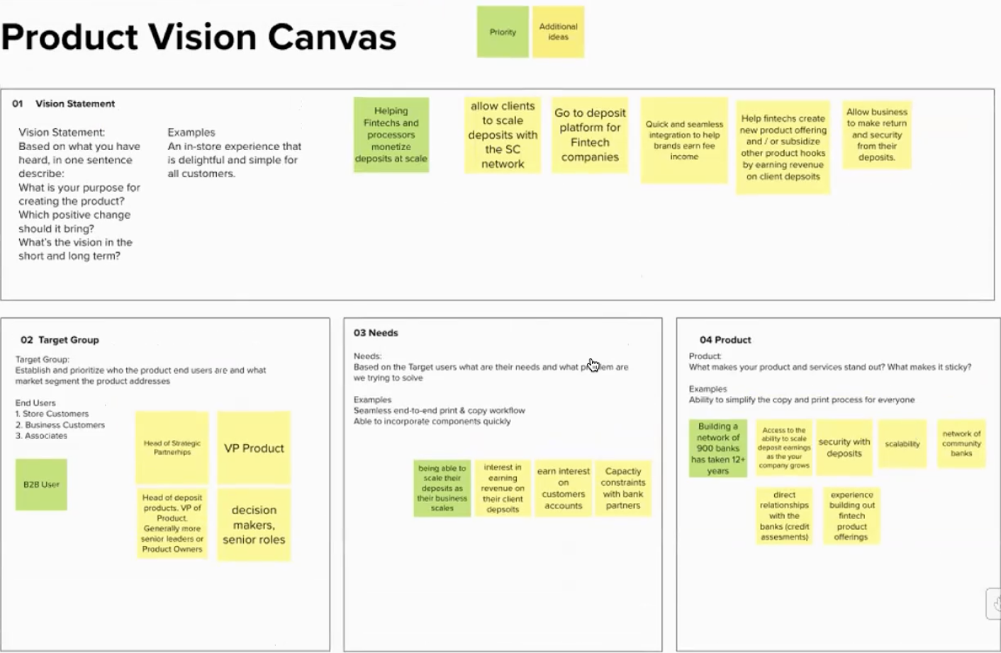
During our initial interviews with stakeholders, we uncovered key insights that informed the redesign:
Conversion Focus: The stakeholders emphasized the importance of streamlining the sales cycle and improving conversion rates.
Trust & Maturity: There was a desire to present a more mature, trustworthy brand identity without losing the approachability that appeals to a broad audience.
Persona & Target Audience
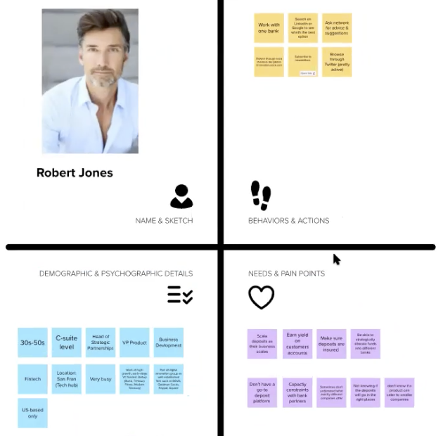
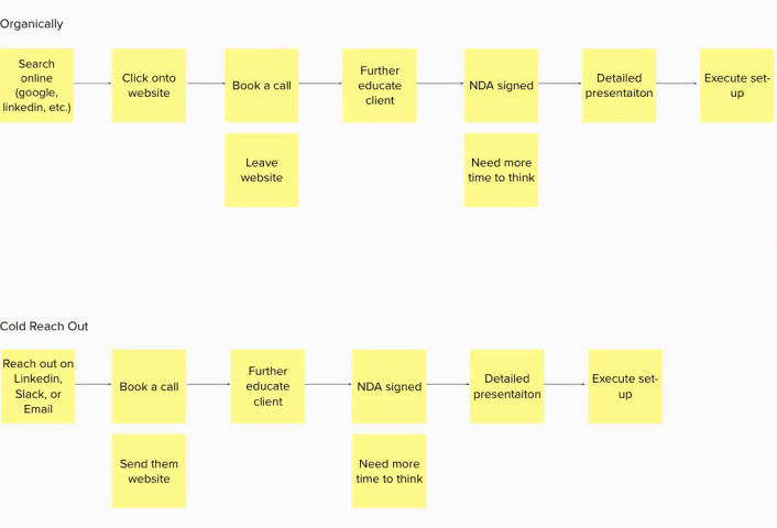
To understand the users better, we created a persona named Robert Jones (image below). Robert is a business executive looking for digital banking solutions that are reliable, scalable, and easy to implement. His pain points included navigating overly complex setups and finding clear information on product benefits. This persona was mainly based on Stakeholder inputs.
Needs & Pain Points: Robert values ease of integration, security, and clear instructions on how the product can fit into his existing business operations.
Behaviour & Actions: Robert often books calls after visiting a website, but he requires more time to think and needs detailed presentations before committing to a product.This persona creation was central to shaping our content and design decisions for the target audience, ensuring we addressed key pain points and provided a seamless journey from exploration to conversion.
Content Strategy
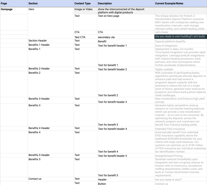
Based on our analysis and discussions with stakeholders, we identified several key improvements for the content strategy:
Simplified Messaging: We reduced complex jargon and used clear, concise messaging to guide users through the site.
Trust-Building Elements: Simplified ‘How It Works’ sections provided reassurance to potential customers.
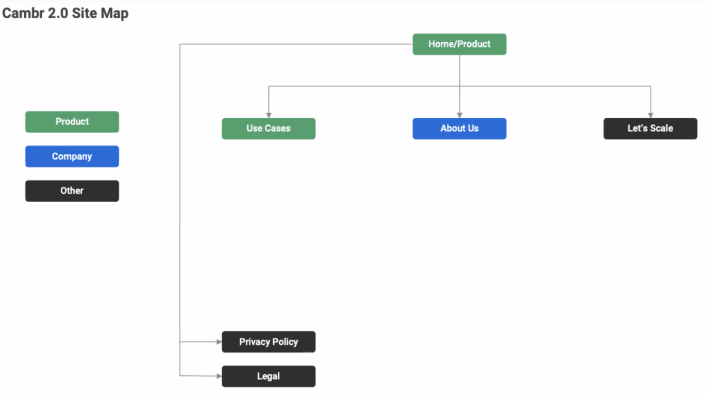
Wireframes & Information Architecture
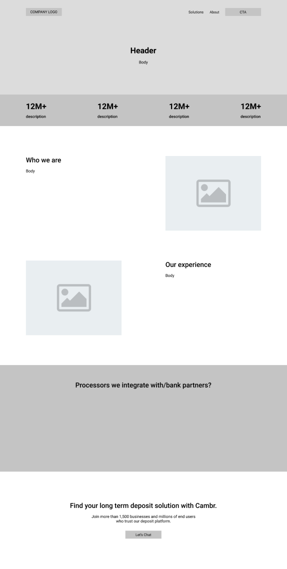
Once the content strategy and visual identity were solidified, we moved on to wireframes and final mockups. The wireframes allowed us to map out the information and key wording.Our redesign was heavily focused on conversion. Key updates included:
Clear Calls-to-Action: strategically placed CTAs like ‘Book a Call’ and ‘Learn more about (a solution)’ were optimized for conversion.
Simplified Content: We restructured page contents such as the ‘How It Works’ section in home page to bring user to key informations faster.


Visual exploration & Final Mockups
After refining the content strategy and, we explored visual design directions. These explorations were mainly conversation starters to point towards the visuals, colours and typography that resonated with the target audience and aligned with the brand’s values.
Mood Boards: We created mood boards to explore various themes, colors, and styles. This helped in visualizing how different elements could come together to create a cohesive look and feel.
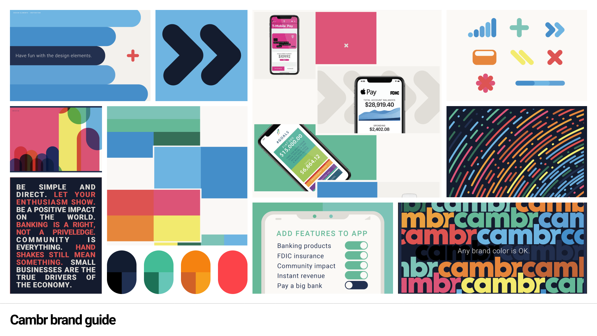
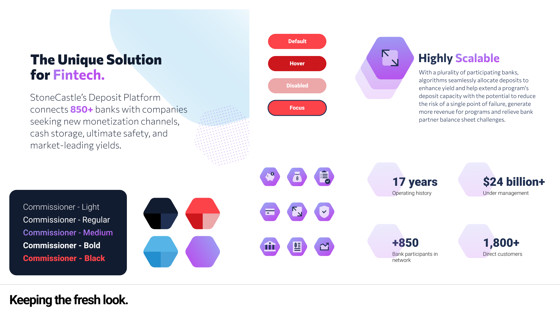
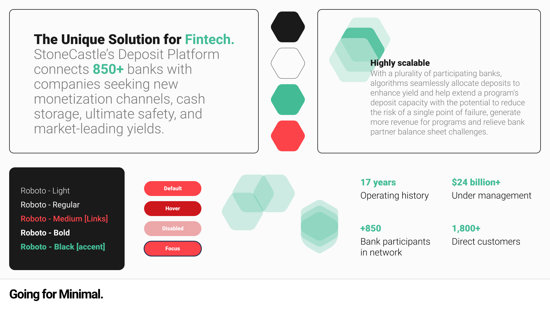
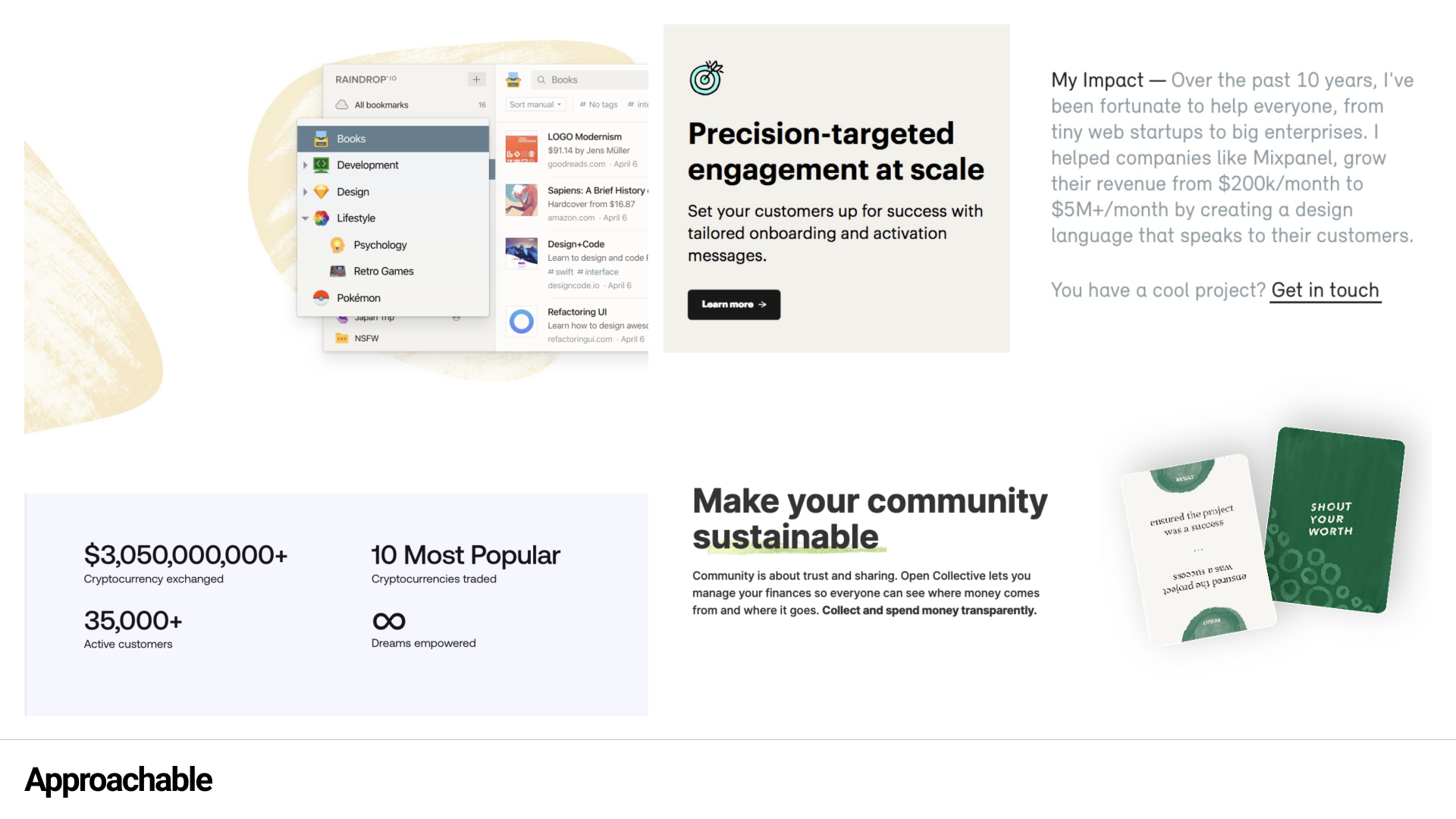
Visual Explorations: We mainly explored illustration styles and colours that looked more approachable, clear and trustworthy which fit our target market and persona.
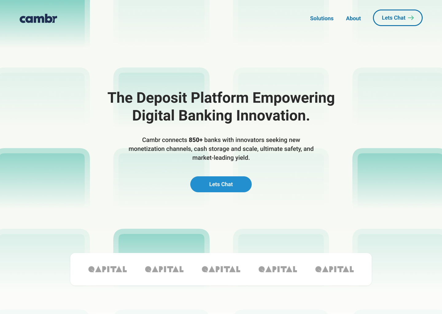
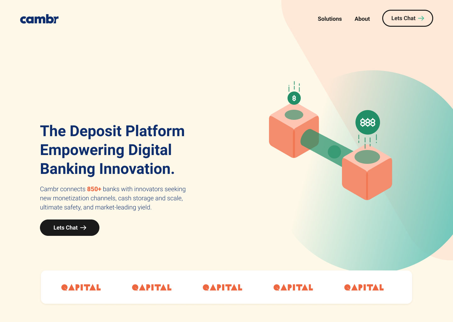
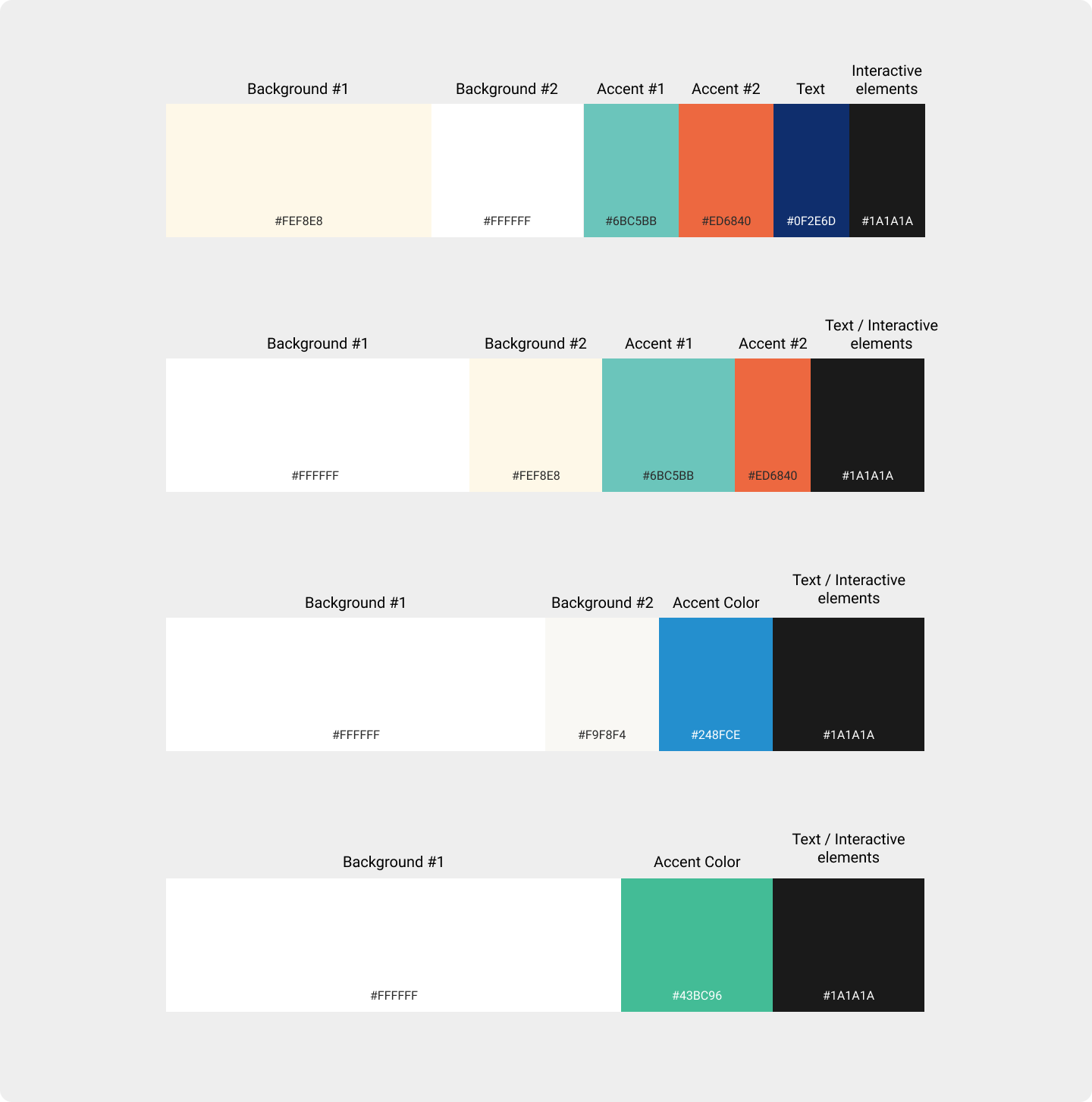
Final Mockups & Deliverables: We mainly explored illustration styles and colours that looked more approachable, clear and trustworthy which fit our target market and persona.


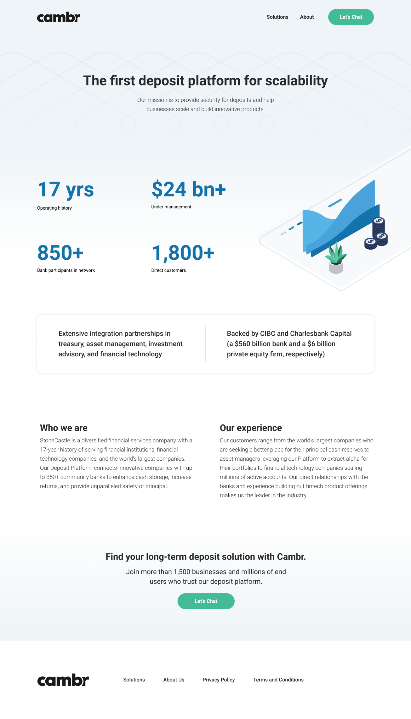
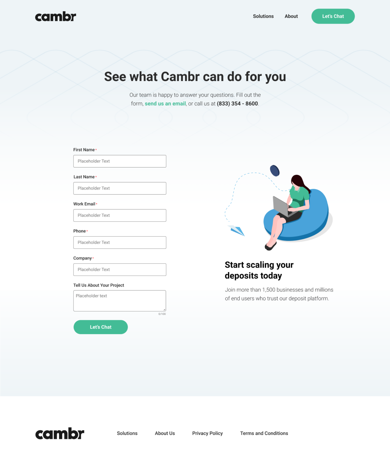
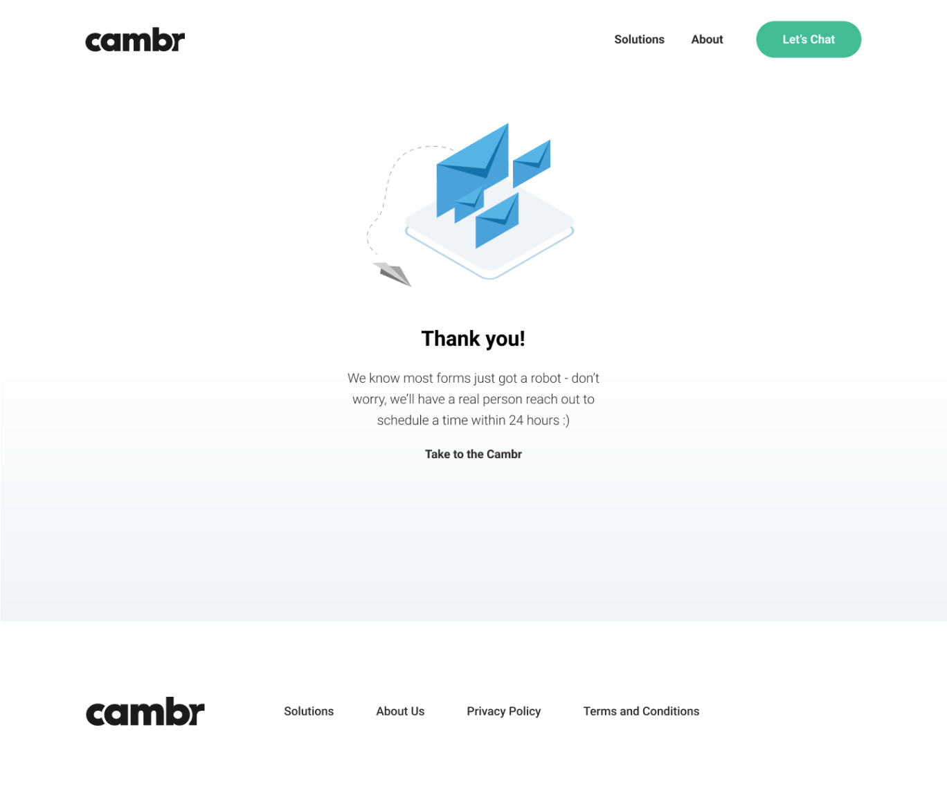
Responsive Design: As part of developer hand off, al the pages were designed on tablet and mobile breakpoints.


Conclusion & Learnings
Through this redesign, we achieved a more trustworthy, mature, and user-friendly website that is positioned for better conversion. Although we haven’t yet gathered data on performance, the improved visual identity, streamlined content, and optimized user journey are expected to drive better engagement and higher conversion rates.
